 The following is excerpted from my September 2006 Garden Portraits Newsletter:
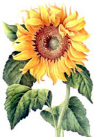
According to Vincent Van Gogh, “Color in a picture is like enthusiasm in life.” The vibrant colors found in my images demonstrate the beauty of the natural world and aim to provide an uplifting visual experience. Color can elicit powerful emotions. I believe that a fusion of colors promotes well-being. Mixing festive warm colors such as red with appropriate quiet cool tones, offers up a harmony that is felt in the soul. Color harmonies encourage a “joie de vivre,” making us feel alive and happy when we view them.
“In visual experiences, harmony is something that is pleasing to the eye. It engages the viewer and it creates an inner sense of order, a balance in the visual experience. When something is not harmonious, it's either boring or chaotic. At one extreme is a visual experience that is so bland that the viewer is not engaged. The human brain will reject under-stimulating information. At the other extreme is a visual experience that is so overdone, so chaotic that the viewer can't stand to look at it.” (See Color Matters) It is the job of an artist to create color harmonies to engage and delight the viewer.
As a garden photographer, I seek pleasing color compositions that speak to one’s heart. I want my viewer to identify with nature, to feel a passion for the earth and what it has to offer. I want the viewer to either see things and feel calming emotions that he has never experienced or I want to bring him back to a familiar place of peace. Nature is a source of healing and viewing its harmonies should help us commune with all it has to offer.
Recently, my good friend and naturopathic doctor Dr. Sara Thyr wrote about the color green. According to Dr. Thyr, “Green is restful and energizing at the same time. When we spend time in nature, not only are we getting away from the harried craziness of our daily lives, we are soaking up the essence of healing.” In the garden, green combines with vibrant yellow, orange, red, purple, pink, and blue for a showy display celebrating life itself. Follow the changing colors throughout the year and experience the vitality of life alongside the passing of time. Profuse harmonizing colors make me feel grounded and alive.
• When choosing colors — whether decorating your home, planning your garden, or putting your kids in complementary outfits for their next photo session — choose contrasting colors. Yellow and purple, red and green, and blue and orange offset each other to create color harmony.
• Mix different tones of color to create fresh textures .
• Don’t be afraid of vivid color. Use accents of hot pink, bright orange, or sunny yellow to
brighten your face or walls. A brilliant blue scarf can make the color come out in your cheeks and a painting with passionate red can make your living space more welcoming.
• When trying to create color harmonies, start with a color that really appeals to you —one that
speaks to your soul. Add on complementary colors in many different shades.
• Don’t be afraid to experiment with color and you may stumble upon a combination that speaks to you on a base level.
The photos in this entry are from Uncanoonuc Mountain Perennials in Goffstown NH. Owner Nettie Rynearson plays with color in the garden more effectively than anyone I know.


No comments:
Post a Comment